Category: Reviews

  • Activity tracking with Misfit and Pebble Time: OneHandedReview

    It’s been over 2 weeks since I got my Pebble Time, and one of the main things I wanted to try with it was the activity tracking functionality. I’ve been using the Misfit app for this purpose for the last 2 weeks. I prefer to wear watches on my left hand as most right handed people do, but having my left arm in a sling has forced me to wear the device on my right hand. This has given me some interesting perspective on the way the app and device work.

    Step counting

    Brushing teeth can be really vigorous
    Brushing teeth can be really vigorous

    Wrist worn activity trackers do have some limitations particularly when it comes to step counting accuracy as elaborated in The Wirecutter fitness tracker recommendation, and my experience has been no different. I found that I was hitting the goal of 600 points (approx 6000 steps) just sitting at home with my arm in a sling, all thanks to the app failing to reject mundane activities like brushing teeth from the count. Granted that I was wearing the device on my dominant hand, but the iPhone 5s is a much better step counter in this regard. The whole purpose of using a wrist worn device rather than a smartphone for step counting is to cover those times when you don’t have your phone with you, but the accuracy in this case leaves a lot to be desired.

    Sleep tracking

    This is one area where the Misfit app seems to do quite well, particularly since the detection is automatic and you don’t have to worry about forgetting to switch to the sleep mode. Since the Pebble Time does not have any sensor to detect whether it is worn, there were times when I removed the Pebble from my wrist and the app thought that I was sleeping. These false activities can of course be deleted from the Misfit app on the phone. There were also times when I got up for a while and then decided to sleep in and the app handled these activities quite gracefully.

    I also did a mini experiment over the last couple of days by wearing the Pebble on my left hand which is bound in the sling at bedtime, and found that the awake periods came down significantly over my previous recordings using my right hand. I wonder whether it will make a difference if I put the Pebble in the pillow cover which should be a similar scenario as my sling bound arm.

    Conclusion

    The Misfit app for the Pebble is pretty decent overall and particularly good for sleep tracking. The battery life is also pretty decent at 3-4 days, when compared to dedicated fitness trackers and miles ahead of other smartwatches. However, if step counting is your primary objective or you want to use it with Android (only the iOS version of the Misfit app supports the Pebble), then look elsewhere. That said, I have found the app pretty useful though I plan to try out some of the other activity tracking apps for the Pebble like Jawbone, FitCat and Morpheuz.

  • Apple Music in India: First impressions

    Apple Music in India: First impressions

    I updated my iPhone 5s and iPad mini to iOS 8.4 this week, and with it came the much anticipated Apple Music. I promptly signed up for the free trial, and have been trying it for the last couple of days. The service seems quite promising, but the Indian catalogue seems to be quite limited at the moment. The iTunes store has a ton of Indian music ranging from Bollywood tracks of different eras to regional ones. However, most of the tracks seem to be missing from the streaming service.

    The interesting aspect is that if you try searching for a particular track that’s not currently available for streaming, you are presented with results of the artist likely indicating that it’ll show up eventually. The new Music app on iOS is also a big overhaul and relegates your music collection to the last tab. I’m already a subscriber of iTunes Match and was able to see my uploaded and matched tracks listed there and also in the search results when applicable. In fact artist pages in the Music app also show tracks from your library in a separate tab when available.

    The Music app also seems to be a bit unstable at the moment and it has crashed on me quite a few times already while streaming music. There were also times when tracks were listed in the album or search results, but when you try adding them to the Now Playing list, they disappear. Looks like it’ll take some time for the service to stabilise in India.

    The only other streaming service that I’ve used at length was Mix Radio thanks to the complimentary subscription that had come with my Lumia 720. That definitely had a very extensive catalogue and I’d augmented my music collection considerably during that 6 month period. I’m sure the other Indian streaming services like gaana, Saavn, Wink etc. have an equally extensive collection. However, Apple is taking on these services head on with their Rs 120/month pricing that’s a fifth of what they’re charging in US. This is of course consistent with their pricing for iTunes Match and the tracks on the iTunes Store. Apps are the only area where there’s price parity between regions it seems.

    Either way, it is a good option for the consumer. The value of iTunes Match priced at Rs 1200 per year in India has become a bit questionable though, as the price difference with Apple Music subscription is just Rs 240 per year. I’m yet to check out the difference between the iCloud music library and iTunes Match. If equivalent, then it’ll be pretty clear as to which service to go with for me.

  • Mi 4: 2 month usage review

    Mi 4: 2 month usage review

    Xiaomi Mi 4 unboxed
    Xiaomi Mi 4 unboxing

    I finally replaced my Galaxy S3 in April after almost 3 years of service. It had begun to show signs of aging for a while, and I had managed to extend its usability for a few months by flashing Cyanogenmod on it last year. The gadetitis relapse hit me in March this year and I began scouting for my next Android phone in March. After lots of debate, it boiled down to the 64 GB versions OnePlus One and the Xiaomi Mi 4, and the Mi fan festival ensured that price was not going to be a factor when choosing between the two. In the end, the smaller form factor and IR port of the Mi 4 won and I even ended up renewing my Flipkart First subscription to get the phone in a day.

    In terms of build quality, the Mi 4 has a very premium feel to it with its steel frame and from the front it has a striking resemblance to the iPhone 5\5s. The back though is a lot more mundane plastic, but there is a faint pattern visible under direct lighting. When it comes to the specs, it is pretty much a Nexus 5 in a prettier package. While it is missing NFC, it does have an IR port that can let you control TVs, ACs etc.

    The camera, while pretty decent, pales in comparison to the iPhone 5s that I also own. Colours can turn out a bit oversaturated in shots and the video stabilization has its own issues resulting in jitters if you pan around quickly with shaky hands. I also discovered that the Carousel app from Dropbox can prevent you from shooting videos if you enable the camera overlay option in that app. I missed quite a few video opportunities before I was finally resolved the issue.

    The on board storage of 64 GB for the price is the real icing on the cake, and this makes a difference over SD card slots when you have a huge library of games like I do thanks to the Humble Mobile Bundle sales. The 2014 flagship class specs comprising of a full HD display powered by the SnapDragon 801 ensure that games fly on the device. It is definitely a lot faster than my iPad mini that’s based on the aging A5 platform. I haven’t faced any heating issues with the phone so far, and the only time it heats up is when the signal is weak or while charging a severely depleted battery.

    On the software front, MIUI also adds a touch of iOS-ness to the usability with some of its design philosophies and then some. Though it’s based on KitKat (without ART support at that), there are also a lot of thoughtful additions that MIUI brings that has kept me from switching to the Google launcher and making Google Now a first citizen. Lack of Lollipop is a bit of a downer, but ART brings its own set of compatibility issues with many games, and I’m quite happy with the phone’s performance and usability for the time being.

    The missing NFC hasn’t bothered me much so far, and it was a rarely used feature of my Galaxy S3 as well. However, with Android Pay around the corner, NFC is bound to become a must have feature. That said, it will be at least a year or two before there’s any significant penetration of the service, and that always leaves room for a phone upgrade.

    Battery life has also been quite good for me and it easily lasts a day even with some gaming and maps usage. During days of lighter usage, it even manages to stretch to 2 days. In fact, it easily beats my iPhone 5s in the battery life department and I can rely on it to get me through a busy day unlike the iPhone. Overnight discharge is also minimal – around 5-6%, while charging is also quite fast and I can get through a day by charging the phone for an hour in the morning.

    Overall, I’m quite happy with the phone and don’t find any compromise or downgrade unlike some of my earlier purchases. It represents one of the best value devices on the market currently, though the Mi 4i is arguably better value if you’re not too fussed about metallic builds and IR ports.

  • A year with a MacBook Air

    I switched to a MacBook Air (2013 model with 256 GB storage) at work from a typical Windows 7 laptop over a year ago (since I manage the app store accounts and iOS needs a Mac) and have had a good while to experience the pros and cons of the system, particularly in a Windows centric enterprise environment. Customary thoughts on the same:

    • In terms of the build quality, weight and size, there are definitely very few Windows laptops that would come close, and none of them are likely to be priced in the typical enterprise purchasing range. And yes, the trackpad is lightyears ahead of a typical Windows laptop.
    • The display though not IPS or retina is definitely much better than the typical Windows laptops.
    • OS X has its advantages and disadvantages versus Windows. I particularly like the multiple desktop feature and Spotlight search.
    • I started off with Mavericks and am currently on Yosemite and do see how OS X has been injected with iOS paradigms. For me that turned out to be an advantage since I started off my Apple computing on iOS devices.
    • Battery life is also pretty good and I can manage a near full day of work without plugging in. However, since I use Chrome as my primary browser due to its cross platform presence, there is definitely a trade off here with it showing up as one of the “apps using significant energy” every now and then.
    • I’ve even used the MacBook for a bunch of video editing in iMovie for some office events and the editing process itself was quite smooth. Exporting the videos was only when I felt the Air’s slower processor.

    In the meantime, I’ve been using a Windows 7 laptop at home (reversed situation over many) and while Windows 7 is just as good an OS as OS X, the real difference in usage experience comes from the SSD, trackpad and display. These compromises by Windows laptop OEMS even in laptops priced close to MacBooks really sabotage the Windows usage experience even for . Things have been getting better in the Windows camp, but there still seems to be a long way to go.

  • iOS 7 on the iPad mini: First impressions

    I managed to install iOS 7 on my iPad mini over the course of last night. Some initial thoughts on the experience so far :

    • It’s a pretty large download at around 750 MB OTA.
    • Lot of greetings in different languages once the device reboots & the setup begins.
    • It is evident that iOS 7 is designed for Retina displays from the setup screen itself with the jagged fonts & display elements, and definitely increases the chances of a Retina iPad mini release this year as some reviewers have noted.
    • The notifications finally make use of the larger display of the iPads.
    • Quite a lot of animations, and it really taxes the hardware resulting in some choppiness at times. Seems to happen the most on the revamped task manager. This is bound to be a lot worse in the iPhone 4, which has the most dated hardware of the devices getting this update, and it’s pretty clear why Apple left out many features on the iPhone 4. I doubt the iPhone 4S will fare much better than the iPad mini or iPad 2 for that matter, as it has a higher resolution screen than either coupled with slower hardware.
    • Speaking of the task manager, it is totally revamped, and totally resembles the Windows Phone task manager including a card for the home screen (which in turn was inspired by WebOS). The multi-finger gesture (4 finger+ upward swipe) to launch the task manager is still the same, but feels odd as the feature is full screen now.
    • Flickr & Vimeo are now first class citizens of iOS, just like Facebook & Twitter.
    • iPhone apps look a lot better now as they use the Retina assets and run only in the 2x mode. Definitely a big improvement on the looks front.
    • Folders seem to have no app limits anymore and open up full screen. However they show only 9 apps at a time, which results in a lot of wasted space. Should’ve been 16 IMO.
    • Auto app updates are finally here, but haven’t seen it in action yet due to the App Store behaving wonky at times possibly due to the load from the iOS 7 release – app updates seem to show up and disappear periodically.
    • The title bar clock now has am\pm in small letters, and can change its colour depending on the app. E.g. Facebook makes it blue

    Below are a few screenshots of the iOS 7 on my iPad mini.

    This slideshow requires JavaScript.


  • Nokia Lumia 720 – One Month Usage Review

    I recently ported my Reliance CDMA connection to Airtel GSM, and this called for a change of handsets. I was using a Samsung Galaxy Pop CDMA with Reliance, along with a Galaxy S III as my primary internet device. My requirements for the new phone were quite simple:

    1. Good battery life since this was to be my primary phone for voice – the Galaxy Pop used to serve me for 2-3 days (without a mobile data connection though)
    2. Price around Rs 15,000
    3. Smooth and reliable performance

    Given the above constraints, Windows Phones seemed to be the way to go, and also give me some platform diversity. There were 3 options – the Lumia 520 (Rs 9500), 620 (Rs 13,000) and 720 (Rs 17,000) which have the same internals (CPU+GPU) thus having similar user experiences. I was pretty tempted by the 520’s price, but the lower quality screen, lack of compass (really important for navigation) and smaller battery was a downer. The 620 was pretty compact with a good screen and within budget, but the small battery was again a downer. The Lumia 720 was above budget, but its huge 2000 mAh battery with a well received camera, display and compact design clinched the deal in the end.

    That’s enough of background, so let’s jump to the main review.

    Specs, Design and Build

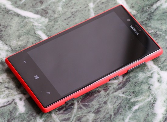
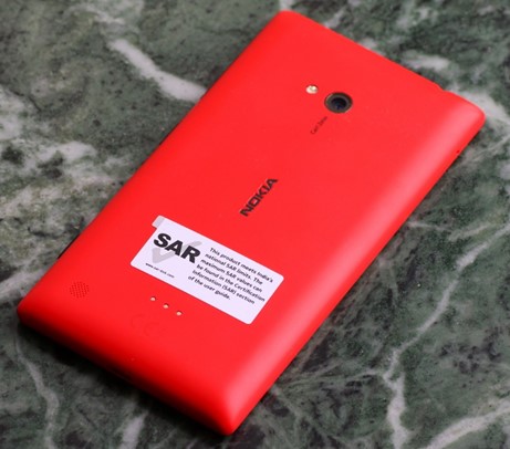
    Yes, I got the red version (there’s also the cyan, yellow, white and black) which has a matte finish. It’s a unibody polycarbonate construction, so no removable battery but the thickness is pretty low. Wireless charging is also supported through special cases (not yet available in India at the time of writing).

    The build seems to be quite robust as I had an inadvertent drop test from my pocket on a wet footpath in Mumbai within a week of purchase. It landed on the bottom right corner and ended up screen down – definitely not the kind of experience you’d want with a brand new phone. Thankfully, I got away with just a chipped corner as visible in the picture below. Looks like the Gorilla Glass 2 works.

    The display is 4.3″ with 800 x 480 pixels in line with Android flagships from 2010-11. The black levels are quite good (not AMOLED levels of course), and outdoor visibility has also been pretty good thanks to Nokia’s coatings and polarizing filters. The ~220 ppi resolution is middling, but text is quite legible without much of aliasing. The display is also supposed to support super sensitive touch allowing it to be used with fingernails and through gloves. I have personally turned it off.

    The LCD display’s RGB layout under a macro lens (in absence of the Anandtech review with the pic)

    The buttons (volume, power & camera) are all placed on the right side of the phone, and I had to get used to the power button placed in the middle. The shutter button protrudes a little more than the other two, possibly due to it being a two-stage button. The micro-SIM tray is on top while the micro-SD card slot is on the left side. Both need to be ejected using a pin (supplied in the box). The micro USB charging slot rounds off the bottom edge.

    Camera

    My personal experience with the camera has been very good so far, in line with other reviewers. It is a 6.7 MP shooter with an f/1.9 Carl Zeiss lens and LED flash. The dedicated shutter button which doubles as a camera quick launch shortcut is really handy. The colours come out quite saturated, and I seem to prefer the resulting shots from the Lumia 720 to my Galaxy S III, particularly indoors. It also helps that the camera launches quicker on the Lumia 720 than on my year old Galaxy S III. The GSIII does hold a large advantage in the shutter lag and continuous shooting speeds. The Lumia 720 takes a couple of seconds to lock focus and capture the frame which can result in a somewhat different composition.

    Shots taken indoors without flash under reasonable lighting conditions turn out really good on the Lumia 720, even better than the GSIII thanks to the large aperture (almost a stop faster). However, under dim light where you require the flash, the GSIII comes out ahead.

    The default camera app on Windows Phone is pretty basic, especially when compared to the Android OEM camera apps, but gets the job done. You can always get hold of other apps (lenses as per WP terminology) to expand on the functionality. There’s a nice ProShot app (paid – just Rs 110 though) that gives you full manual control over the camera settings. Higher end Lumias (PureView branded 920 & above) of course get Nokia Pro camera app with the latest update, so this is the app to get for the lower models.

    Video output is also pretty decent though it supports only up to 720p video. Then again, I don’t really shoot much video and have a good old DSLR if I want to do serious shooting.

    User Experience

    It has been almost a month since I got the Lumia 720, and so far the experience has been really good barring a few quirks that I’ll cover in the next section. A little bit of context in terms of my usage of the Lumia 720 – my primary internet device remains the Galaxy S III with its significantly larger screen. Plus, I’m pretty much locked into the Google ecosystem (Gmail, Maps, Keep, Contacts etc) and any platform that is not Android will be unable to give you the best experience (iOS included, though Google is trying its best for that platform while actively ignoring Windows Phone). Microsoft Exchange support is also not the best on Android with experience varying with the OEM in question (I found the HTC interface quite different from Samsung’s).

    However, the Lumia is my primary phone for voice calls and SMS, and in this regard, the experience has been very good aided in no small way by the humongous 2000 mAh battery that gives me 2-3 days of service without a hitch (and that is with data services and email sync enabled). I have also configured my office Microsoft Exchange account (mail, calendar, tasks & contacts) on the Lumia and find the experience to be a lot more consistent than when I had it configured on my GSIII.

    The interface is really smooth without any stutters that you find in Android handsets in this price range. The 512 MB RAM does make its size felt when you see the “Resuming” screen when launching apps, but once launched most apps have a very uniform experience. The Live Tiles Metro interface is quite handy with the People hub being one of the strong points in organizing and staying in touch with contacts.

    The ability of apps to control the lock screen background out of the box is also a nice touch. For example, you can allow the facebook to cycle through your photo albums (you can choose the albums) for the lock screen. Notifications are however almost useless on the Windows Phone platform. The closest it has to a notification centre is the lock screen where you can see unread\new counts for up to 5 apps of your choice along with details for 1 app. Live tile counters also try to solve this issue, but still can’t match up to a dedicated notification centre. This is especially a big downer coming from the rich notification centre experience in Android.

    On a positive note, the Lumia 720 came with a 6 month Nokia music subscription and the collection is quite good. The songs are downloaded in the form of 32 kbps MP3 files that can be transferred to a PC. So, if you have an iTunes Match subscription and re-encode the tracks to 80 kbps (minimum for iTunes Match to consider them) or higher, you can get hold of high quality 256 kbps versions for free.

    The 8 GB phone storage can run out pretty quickly if you start clicking a lot of photos, videos & downloading music. Good thing that the phone supports up to 64 GB of SD storage (apps can’t be transferred to SD though), though I haven’t popped in one yet.

    In terms of apps, some of my most used ones like Whatsapp, Kindle, Foursquare Facebook etc are present. But, the lack of the usual cloud backup apps like Dropbox and Google+ is also a downer, though you can backup photos and videos to SkyDrive.

    The browsing experience is also ok, though the absence of alternatives like on Android can get in the way given that many sites don’t play well with Internet Explorer. E.g. Meru cabs presents their desktop site in mobile IE on the Lumia.

    Sharing across apps also works quite well (better than iOS) with the ability to easily share photos and videos through apps like Whatsapp, facebook and email.

    Maps and navigation is also pretty decent with the ability to download offline map packs for specific states in India. I am a Google Maps user on my GSIII and haven’t spent too much time with HERE maps and drive combo. The Lumia 720 has a built in compass (unlike the 520), and navigation shouldn’t be problem. Traffic information is also available on HERE maps.

    I really miss the blocking mode that silences the phone at specified times of the day (typically for the night), and the absence of apps like Llama and Tasker available on Android, possibly due to OS limitations make it impossible to get third party solutions for automating tasks. I use Llama quite extensively on my GSIII to automatically silence my phone in office, during meetings, in movie theatres, switch on wifi at home etc. NFC, though available and supported, is not an option either due to the limited scope of actions. NFC can only be used to launch apps\settings and not automatically toggle them.

    Quirks

    Pretty all the issues I have had with the phone are due to the OS, i.e. Microsoft, and here they are briefly:

    • Poor Google contacts integration – I have found many phone numbers missing from my contact list that show up nicely on my GSIII.
    • No notification centre – it can get really tough to figure what your phone was buzzing you for.
    • You can’t edit phone number in the dialler – can be a bit of a problem when you are roaming and need to prefix digits before dialling.
    • NFC support is really limited – you can just launch apps\settings but not trigger any actions automatically.
    • Quite a lot of apps are available, but many are not updated regularly.
    • Google actively ignoring the Windows Phone platform – they dropped active sync support, haven’t introduced any official apps (barring search) and are trying their best to prevent Microsoft from creating any substitutes.
    • The dedicated hardware search button is practically useless – I don’t use Bing (the lens is useful though, a la Google Goggles). In fact, even Google dumped the hardware search button in Android long ago.

    Conclusion

    I am quite happy with the Lumia 720, but that is largely due to the fact that my usage is split between the Galaxy S III and this phone. It would definitely be difficult to get by with the Lumia 720 as my primary phone, but it complements the Android phone perfectly. Why not just stick to the Galaxy S III you say? Battery life for one, and the general degradation in responsiveness of the GSIII over the last one year for another.

    Nokia has lost out big in the smartphone race, but it has really introduced compelling choices in the Windows Phone 8 camp. If you are a first time smartphone buyer (no Google contacts baggage, app dependency), the Lumia 720 is a very good choice. In fact, for a new smartphone user with a budget below Rs 20,000, it would be very difficult to beat the Windows Phone triumvirate of the Lumia 520, 620 and 720 (especially the 520 below Rs 10,000) in terms of user experience (smoothness particularly). Then again, I have seen many of my friends and colleagues shy away from Windows Phone to the Android camp due to its radically different user interface. On the high end, Nokia PureView branded Lumia phones (920, 925, 928 and 1020) have the best cameras and the Lumia 1020 is practically a Point & Shoot replacement. So, if you are planning to replace your camera and have an old smartphone (or none at all), the Lumia 1020 is a really compelling choice.

    As for Windows Phone, Microsoft really needs to up its game like it has with Windows Blue\8.1, and bring the platform up to speed in terms of must have features (notification centre, browser). Nokia is doing its best to stay in the game and introduce cutting edge features where possible (Lumia 1020), but is slowed down by Microsoft’s slow rate of platform updates.

    Now that I’m a Windows Phone user, I can appreciate its merits vis-à-vis Android and iOS, and hope that Microsoft can up the game the way Mozilla did for Firefox in the last couple of years in face of Chrome’s rapid ascent. Microsoft’s iOS 7 moment can’t come too soon.

  • Tradus vs. Shopclues – Which Is Better and Why?

    This is a guest post by Himanshu & Rohit Agarwal of couponlava.com

    Shopping online is a pleasure as it gives the shoppers an overwhelming range of products to choose from and for a price unimaginable. While people are getting used to the benefits of shopping online, promoters in online, try their best to attract customers to their stores. In the past, the idea of maintaining a store may not have been appealing to many. Now, you find the best academic minds along with the best business acumen enter the online world to conquer the hearts of customers. Every new online store competes not just with another new store but goes straight for the best in business with all its marketing tools. Hence, it is no wonder that Shopclues should try to get past Tradus, its senior by one year.

    Entry Into Online World

    Tradus entered online business in the year 2010. Tradus.com serves as a link between merchants and customers. It deals with a wide range of products, which includes apparels, jewellery, toys, mobiles, cameras, home décor and a lot more.

    Shopclues was founded in the year 2011. Its collections include apparels, electronic appliances, jewellery, kids & toys, accessories and so on.

    Range Of Products And Price– Tradus Leads But Not Impressively

    Shopclues has a wide range of products but Tradus has the winning combination of excellent product range in various price ranges. An ideal place for a customer would be to find a variety of products offered for a reasonable amount. However, it has to be mentioned that there are times when many products in Tradus go out of stock. It either might create a feeling that the online store is not quick to replace sold products or is concerned to show an impressive image by projecting an increased number of products. If that aspect is well attended to, Tradus would score convincingly over Shopclues, which offers a variety of products for a discounted and low price.

    Quality – Tradus Does Better

    Where quality is concerned, Tradus shows a better performance. While the quality of apparels, accessories and a few other categories could be same in both the sites, Shopclues seems to be a bit low on electronic items.

    Delivery – Below Expectations

    Delivering on time is an important factor where online stores are concerned, as this is one of the reasons for people to favor direct shopping. During physical shopping, they pay and receive their products immediately. Most of the people hate to wait to have their stuff arrive, particularly if they have made payment in advance. Hence, to reach out to customers, it is essential to adhere to delivery promises. As far as delivery of products is concerned, both the sites have not seemed to be in the favored list of customers. Many people complaint about delay in delivery.

    Customer Service – Is There One?

    There is a pathetic display of customer service by both Tradus and Shopclues. In the world of internet, bad reviews reach faster. If a company does not mind about the reviews and still carry on in the way it seems fit, it could only be considered as poor show of service and total disregard for customers once the payment is received. This is one area where both the online stores should work and show that they do have a customer service wing and they are there to address the concerns of customers.

    More Or Less The Same

    Going by the reviews, we cannot just yet say that one store is better than the other online store. Tradus has more products but lots of out of stock products. Its quality is better. Otherwise, there is not much of a difference between both the sites. As far as Shopclues is concerned, it has to be said that it fares better in the reviews but the negative reviews say a lot about their performance and customer service. Since it is less than two years of age, we may hope that it sets right the problems and start performing better. It does give a tough fight in promotions and its Shopclues coupons offer great discounts like Tradus coupons. Tradus leads only marginally and being in the field for two years, it is high time it started showing improvement.

  • What has The Dark Knight got in common with the Heroine?

    Thoughts on the Heroine movie:

    • The background score has an uncanny resemblance to the Batman score
    • Follows the Madhur Bhandarkar movie template to a t, and makes it extra boring and predictable.
    • On the subject of predictability, no surprises whatsoever in the plot, except the ending. Probably shows how desensitized I’ve become to all the drama (have you?).
    • Talking of endings, that’s another uncanny resemblance to the Batman series – The Dark Knight Rises this time.
    • People seem to be finding solace in European countries these days, though the film doesn’t disclose the exact one (unlike ZNMD)
    • Lead character is slightly less demented than the Rockstar counterpart, though not by much. I’m beginning to wonder you need to be bipolar to become a star.
    • This ain’t no Sunset Boulevard.
  • Ek tha Tiger – mini review

    Yes, I watched the movie – and don’t ask why:

    • The story is by Aditya Chopra, and there’s a DDLJ tribute(?) in the climax. Imagine the climax train sequence of DDLJ & replace the platform with an airfield, the train with a plane, SRK with Katrina Kaif, Amrish Puri with Ranvir Shorey & Kajol with Salman Khan. (yes, like for like)
    • Yes, that’s a tram that’s stopped by Salman in one of the action sequences. So, if you live in Kolkata or have been there, you know what I’m trying to convey (then again maybe not so bad)…
    • The Indian govt. probably had a stronger reason than the Pakistan to ban the movie, but they didn’t. If you are used to the Sunny Deol brand of spy games, prepare to be surprised.
    • And finally, I’m not sure what happened to the special anti missile tech that Salman was trying to protect. I can only assume that the hard disk with the RAW sealed the deal.
  • HTC One V: 2 week usage review

    Update (17 Aug 2012): My HTC One V died last month (in less than 3 months), and by died I mean totally bricked just sitting in my pocket – wouldn’t turn on or charge. This seems to be a fairly common problem with the initial batches of the phone. I changed my flipkart review due to this. In case you are wondering what the problems are, try searching these terms on Google: “HTC One V dead”, “HTC One V not turning on” & “HTC One V bricked”.

    Original review

    I finally gave up on the Android dead end (no ICS upgrade) that was my Galaxy S i9003 and decided to jump to the ICS bandwagon. The only options for an out of the box ICS experience in India at this time are the HTC duo – One X & One V. Of these, the One X was beyond my budget, and so it was a pretty simple decision to go for the One V in the end.

    Reviews have been pretty positive, and I’m throwing in my 2 cents based on a 2 weeks of usage experience that wouldn’t have shown up in initial reviews. A caveat on my usage experience – I use the One V (and the Galaxy S before it) primarily as a mobile internet device (mails, browsing, e-commerce, social networking etc.) rather than for phone calls.

    What did I get over the Galaxy S i9003?

    The build quality is definitely impressive with the metal body, and it is also sleeker than the Galaxy S. I personally prefer the One V’s build quality over the Galaxy S.

    In terms of software, ICS definitely offers a better experience than Froyo (there is a Gingerbread update for the Galaxy S, but I never got to install that during my 1 year with the phone – Kies didn’t work, so I ended up installing it through Odin). It is also a lot more stable, and I haven’t had any lockups that required hard reboots on the Galaxy S.

    The HTC widgets are also pretty handy plus there are the new ICS widgets for Gmail & Email, I’m still using the Sense launcher on the One V. I had replaced the Touchwiz launcher on the Galaxy S with Launcher Pro. The Gmail & Mail clients are also definitely improved over Froyo. In particular, the mail client now has better support for Microsoft Exchange with better threaded views and flag support.

    The main camera is also pretty good on the One V, though the resolution is still 5 MP like the Galaxy S. The optics are definitely better (f2.0 lens), and there’s also an LED flash (not that useful though, as it tends to blowout the photo). The bigger improvement is on the software side with the negligible shutter lag, incredible burst mode and the quick launch option from the lock screen (you need to have the camera icon in the tray for this).

    GPS performance is another area where there is a big leap with the One V locking on pretty quickly. This is an area where my Galaxy S was severely lacking, and I left GPS off most of the time, unlike the One V where I have it on most of the time.

    Battery life on the One V also seems to be better compared to the Galaxy S. It holds out pretty well over the day even with sync and GPS active, even though the battery capacity is lower.

    The SoC of the One V is also better than the Galaxy S – the Qualcomm CPU-GPU combo has better performance than the TI CPU-GPU combo in the Galaxy S. GPU performance is particularly better (aided by the ICS improvements).

    Also, did I mention that I can use Chrome (ICS only for now) on the One V.

    What did I give up?

    The most obvious downgrade is in terms of the front camera, as the One V doesn’t have it. However, I rarely used it on the Galaxy S (didn’t work with Skype, possibly due to Froyo lacking native front camera support), so not such a big loss personally. Then again, the front camera does make for a handy substitute of a mirror.

    The One V also lacks a digital compass (wonder whether it is due to the metal body), and is not able to show you the direction you are facing on maps unless you are on the move. In addition, apps like Google Sky Maps which relies on the compass to show you the skyline are virtually useless (maybe if I run around in circles with the GPS on, it’ll know the direction I’m facing). This is a more serious omission for me, but I’ll have to learn to live with it.

    The screen size is also smaller, and makes for smaller on screen elements for tapping. Not a very big difference, but when it comes to browsing and interaction, a larger screen is always handy.

    The battery on the One V is also sealed in, while it could be replaced on the Galaxy S. Then again, I never really had an extra battery, and it was actually a bit of a bother as I had to remove the battery on the Galaxy S to insert the SIM. This makes the One V sleeker, so a net gain for me. Also, battery life on the One V is better than the Galaxy S.

    The missing physical menu button on the One V (due to the ICS UI changes) was also a bit of a problem initially with apps like Whatsapp, facebook etc. that have their settings accessible only through the menu button. However, I discovered that a long press of the app switching button simulates the menu button press, and the settings have not been able to hide from me ever since.

    What remains on par?

    Though the screen size is smaller, the screen resolution is the same (480×800), which makes for a better pixel density. The camera resolution is also the similar, and so is the RAM (around 500 MB) and on board memory (4 GB, but less of it is available to the user on the One V).

    Migration pains and misc.

    There is still no simple way to migrate from one Android phone to another, especially when they are from different OEMs. For all the talk of everything moving to the cloud, and iTunes remaining a big bloat, the iOS-iTunes combo still remains a good way to backup and restore your apps (I own an iPod & iPad 2 as well). It is a big pain to have to install every downloaded app all over again, and then set them up.

    That said, my photos & videos made a seamless transition thanks to them being stored on the external SD card that I moved from the Galaxy S to the One V. However, I can imagine things won’t be as simple for Android phones that lack external storage support. Moving apps to the SD card in hopes of them being restored on the new phone also didn’t play out as expected and I ended up setting up the apps all over again. Android needs to better way to tackle this issue, as the people change phones pretty often and setting it up every time results in a lot of wasted time.

    While stability of ICS is definitely improved over Froyo (or at least HTC’s version of ICS is better than Samsung’s version of Froyo), there are still some nagging issues. The Play store still shows the same app updates for some apps at random, even after they have been installed. The data connection just freezes at times, and only a phone reboot seems to fix it (airplane & data mode toggle don’t seem to help). The calendar widget doesn’t refresh properly every day, so I end up seeing the current day mentioned as tomorrow\day after.

    The UI can also be a bit sluggish at times, but it is definitely an improvement over the Galaxy S. I suspect Android requires a dual core to perform well, as the Galaxy S II was one of the first Android phones where the reviewers didn’t mention the UI lag.

    And last but not the least, it still doesn’t play Fruit Ninja as well as my 3rd gen iPod touch.

    Bottom line

    The One V is one of the best phones available under Rs 20,000 at the moment. In fact, it is cheaper than the Galaxy S i9003 (it has held up its value well over the last year – still costs around Rs 19,000). Of course, you can get older phones that have ICS upgrades rolling out at similar price points, but the One V has the hardware to hold its own. Barring the digital compass and app setup, it was a satisfactory upgrade to my Galaxy S i9003.